Hey, feedback would be appreciated and returned. :)
http://www.makingnewmaps.com/maps/Daniel_Bissill/index.html
Monday 6 December 2010
Sunday 5 December 2010
One shot personal edit
Lost in thought personal edit from Dan Bissill on Vimeo.
This is my personal one shot edit. I decided to play around with different colour effects which was inspired by a music video by Two Door Cinema Club in which they have a background that changes colour constantly. I think it works well and doesnt really distract the viewer from the video.
Thursday 2 December 2010
Interactive Space Rationale
tiveThis interactive space project overall was a fun process. At first, i found it a bit weird and challenging using html and Dreamweaver, but after a few goes on it i finally got the hang of it and the coding. The idea i had was based around my travels. Taking and finding images that i needed to take/took were tough as i didn’t really know how my images would all link up. I actually considered scrapping this idea as i couldn’t think of a narrative to support my images, but after some thinking and brainstorming i came up with an interactive calender idea in which the user clicks a month in the year and it takes them to a destination, e.g February takes you to Spain.
I felt using Adobe Dreamweaver was a lot quicker, more efficient and easier than html as you could visually see what your page would look like and could navigate the hotspots easily to suit my needs. With my images i decided to edit them in Adobe Photoshop by making the whole photo in black and white apart from a certain part of the image which indicated the hotspot. I believe this creates an effective mood to the story drawing the users in.
Overall i am pleased with my interactive space project however if i had more time i would link some of the pages up better as there are loose ends e.g clicking on a later month would lead you quicker to the end of the story. Therefore if i had more time i would improve this so these loose ends were fixed. Despite this, i thoroughly enjoyed this project.
Wednesday 1 December 2010
Interactive space
Originally i started off with a really basic narrative which wouldt really work with the pictures i took.
Therefore i thought to brainstorm some ideas and eventually came up with a 'interactive' calender. The narrative would be based on my journey to differnet parts of the world and would be represented by a little ball with my face on it. 

To assemble all the images into the correct order, i find it easier to jot down the order rather than remember the order in my mind. I believe that i am am a visual person, meaning that i prefer and find it easier to see things infront of me.
A key effect i used in this process was the have the hotpoint in colour and the rest of the photo in black and white. This was achieved on photoshop.
Monday 22 November 2010
Re-designing
 I chose to re-design this CV mainly becuase it looks unprofessional and has no sense of layout or allignmet. It is quite difficult for the naked eye to actually tell what is going on which is mainly due to the scattered information. To improve this, the information should be clearly attatched to the heading.
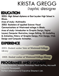 Another aspect of the CV that can be changed is the fact that there is a spelling mistake in the word 'Graphic'; the 'P' is missing.
This is a re-desgin of the CV just seen. I believe this has a more professional look due to the clear headings which are then followed by the important and meaninful words that should be involved opposed to irrelevant information.
A neat and exciting text has been used with some little alterations to make it stand out. For example the deep bold black headings and the fish-eyed effect 'job title'. This gives the page a funky feel.
Here is another design i altered....
The problem with the front cover to the 'Band of Brothers' DVD cover is the fact that there is a divide between the top and bottom half of it. There is very little going on at the top in contrast to the bottom where there is too much going on mainly due to the overcrowding of words. Therefore i intend to create a more even layout.
This is my re-design of the cover for 'Band of Brothers'. The main difference is the fact that the layout is simpler and i believe more effective as there are two pieces of text on either side of the soldiers. In terms of the allignment, i went for a centered one. My reasons being that it matches well with the soldiers on the front creating an even balance between them and the text.
Sequence two!
Ted didn't like being defeated in squash today. Let the punishments begin!
Let's toast him...
Or grill him...
Perhaps boil him...
That's enough torture, back to where he belongs!
Let's toast him...
Or grill him...
Perhaps boil him...
That's enough torture, back to where he belongs!
Sunday 21 November 2010
One shot group edit + rationale
This is our final one shot video. It was fun making it and looks effective with the projection which makes one it appear unique. This was our group edit.
The one shot project was the one i enjoyed the most. I felt more in my comfort zone as i love anything to do with film and cameras etc. In terms of the various ideas we thought of as a group, we decided to experiment and make the idea as original as we could make it. We came to a conclusion that we would film someones thoughts. An idea of thought bubbles was discussed and was developed further so that thought bubbles would be projected onto a screen. We were originally going to have moving images in the thought bubbles but due to timing restrictions we used still images instead. The thoughts were pre recorded and were projected onto a screen on the day of the shoot.
Our first shoot established many problems and scenarios we struggled to resolve. It was a day of trial and error mainly because it was the first time we had worked together. It was difficult to establish who was doing what as everyone had a go at everything instead of having set jobs. In addition, there were flaws with the actually composition, for example there were objects and other distractions that were hard to avoid. Therefore we booked a different room knowing what to expect and filmed a few days later.
Our second shoot was more successful; the composition was good and had no distractions from fixings/objects. However as a team we found it hard to master the technique of lighting. We kept having trouble with shadows and spent quite some time trying to conquer and achieve the best lighting. Despite this, it was a lot of fun and achieved a good one shot in terms of the composition and narrative.
Wednesday 17 November 2010
Visual storytelling!! EXAMPLE!!
Subscribe to:
Posts (Atom)


