 I chose to re-design this CV mainly becuase it looks unprofessional and has no sense of layout or allignmet. It is quite difficult for the naked eye to actually tell what is going on which is mainly due to the scattered information. To improve this, the information should be clearly attatched to the heading.
 Another aspect of the CV that can be changed is the fact that there is a spelling mistake in the word 'Graphic'; the 'P' is missing.
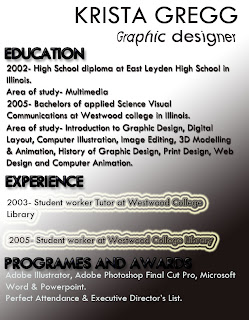
This is a re-desgin of the CV just seen. I believe this has a more professional look due to the clear headings which are then followed by the important and meaninful words that should be involved opposed to irrelevant information.
A neat and exciting text has been used with some little alterations to make it stand out. For example the deep bold black headings and the fish-eyed effect 'job title'. This gives the page a funky feel.
Here is another design i altered....
The problem with the front cover to the 'Band of Brothers' DVD cover is the fact that there is a divide between the top and bottom half of it. There is very little going on at the top in contrast to the bottom where there is too much going on mainly due to the overcrowding of words. Therefore i intend to create a more even layout.
This is my re-design of the cover for 'Band of Brothers'. The main difference is the fact that the layout is simpler and i believe more effective as there are two pieces of text on either side of the soldiers. In terms of the allignment, i went for a centered one. My reasons being that it matches well with the soldiers on the front creating an even balance between them and the text.


No comments:
Post a Comment